Hi friends! Today I am sharing a Christmas card from the latest Poppystamps holiday release, the Nordic Sweet Angel die. I can’t say enough about how much I love this darling angel.
I used gorgeous glitter, metallic and pearl papers from the specialty 6 x 6 paper packs.
I diecut the angel’s face and hair out of watercolor paper and painted in the skin tone, hair and pink cheeks!
The background is Lavender Bloom paper from the Poppystamps 8.5 x 11 color cardstock. I used the largest frame from the Scalloped Pinpoint Frames. Five frames come in this die set.
I popped up the skirt and halo with dimensionals to level out the height of the wings.
I adhered the pieces together on a white cardbase. The finishing touch is the gold foiled greeting tab with a fairy jewel on top!
One more look at the beautiful effects of the specialty papers in the light.
Have a wonderful day, please check out the Poppystamps release @poppystamps.com. It is filled with so many amazing dies, I can’t say enough!
Happy World Card Making Day! It’s October and welcome to The Friends of Unity Blog Hop! The theme for this month is a Color Challenge.
We have a special giveaway – play along with our color challenge and add your card to the album over on the Unity Show & Tell FB page. Amber has a special giveaway happening for entries and all of the details are over on her Blog (it is the last stop on our Hop) Good luck!
Card #1 – Positive Currentsby Unity Stamp Company
Koi fish are so beautiful! Many years ago my dad’s aunt and uncle owned a koi farm. I remember visiting them and feeding the fish, throwing pellets into the large ponds! The koi came in so many colors and the gold ones were the most sought after.
To create this card I stamped the images on watercolor paper in Versafine ink and painted red orange (Prang watercolors) and metallic gold (acrylic) spots on them. Next I watercolored brown over and over the background. I added the darkest brown right up against the white on the fish to build contrast. Then I stamped the sentiment and spattered gold acrylic paint over the surface. I mounted the images on rich brown cardstock before adhering to a kraft cardbase. Two jewels at the bottom right corner, finish the card! Tip–I went over the eyes with a fine point black Sharpie to enhance the eyes!
A close-up of the beautiful effect metallic gold paint gives off as the sun shines directly on it!
Card #2 – Winnie the Pooh: No Fun Without Youby Unity Stamp Company
Tigger is pure happy with abounding energy! I wish I had that much spring in my step! I kept this card very simple because Classic Pooh is so beautiful without alot of fluff! I hope the background isn’t too much!
To create this card I loosely blended all the colors from the challenge on a sheet of watercolor paper. I stamped Tigger with Versafine ink and added a wash of orange. I went back over the stripes with black paint. Next I diecut the paper with a fine dotted edge using the Poppystamps Scalloped Pinpoint Frames die. Then I adhered it to a kraft cardbase. Finally I stamped the sentiment and that’s it!
The sentiment is perfect to send to someone who is getting back up on their feet and needs a little love and encouragement.
Card #3 – Scaredy Cats by Unity Stamp Company
These felines just crack me up! I love their expressions and just thought of making a silly, all over the place card. I am not sure how I feel about this card but sometimes it’s fun to just throw a curve ball. (Go Mariners!)
To create this card I first stamped the hilarious cats on various brown cardstocks and fussy-cut them out. I painted the one peeking out with watercolors. Next I die cut a scalloped border by Gina Marie Designs with red cardstock and adhered it to a kraft cardbase. I glued a cool red patterned paper over the top to be the background. I overlapped the cats and made sure they ran over the edges. I popped up the middle cat, he is my favorite. What a cutie! I stamped the sentiment on a piece of kraft and roughed up the edges. A thin strip of worn metallic brown paper and gold orange jewels completes this card!
Maybe this card explains a chaotic world that somehow comes together with hugs and humor!
Thanks so much for stopping by. Below is a list of the friends on the hop. There are amazing cards with tons of inspiring ideas and creativity to see. Don’t forget to comment and check out the giveaway at Amber’s link, the last stop on the hop.
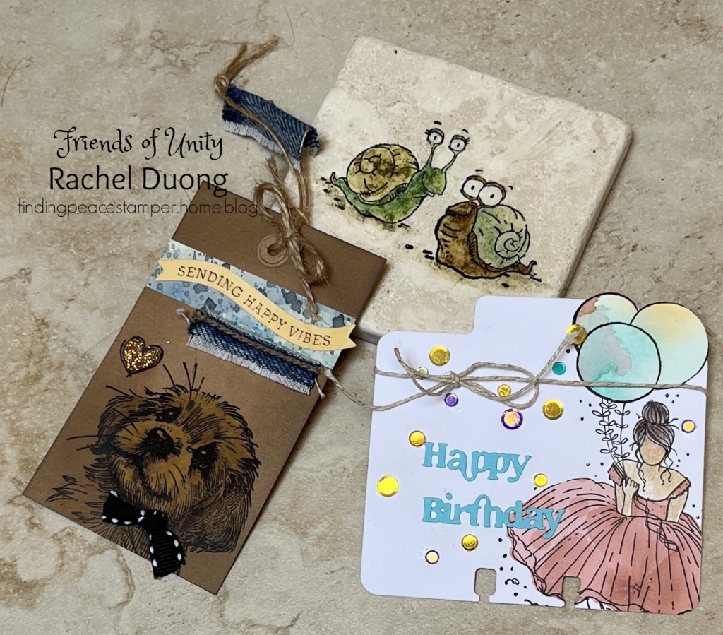
Hi friends! It’s September and The Friends of Unity Blog Hop this month is all about creating “Anything But a Card”. Isn’t it always a great idea to make use of our stamps in more ways than one?! I love it!
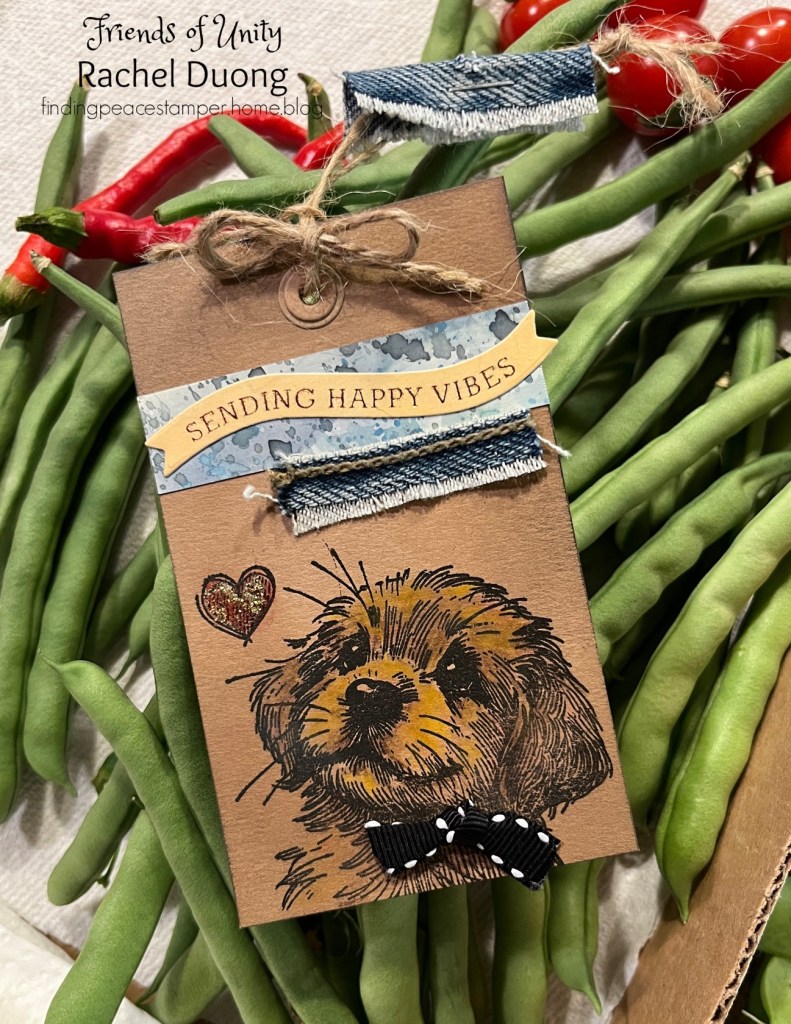
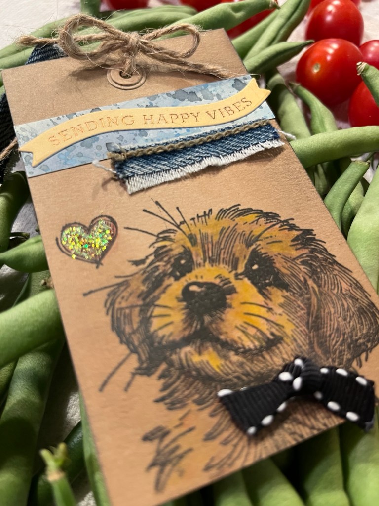
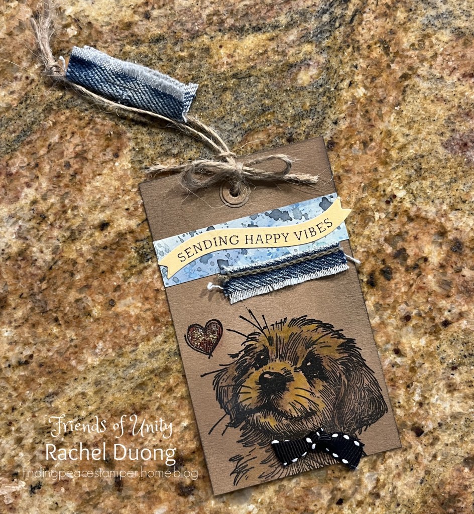
Project #1 ~ Gift Tag, Rescue Tales Chip stamp set by Unity
My first project is a gift tag with the most adorable puppy named Chip. He melts my heart everytime I look at him. I stamped Chip on a rectangular piece of kraft cardstock. I colored him in with Prismacolor watercolor pencils in brown, yellow and orange tones. Yellow brings out the front of his muzzle and gives him a dimensional quality!
I grabbed a scrap of watercolored paper and adhered it above Chip. I added the foiled Poppystamps sentiment over the strip. Denim is always a good thing so I added it below the sentiment for interest and texture. Black stitched grosgain ribbon in a knot looks sweet on Chip’s collar. Red pencil on the heart and then Stickles over the top for a little sparkle! (Background is vegetables from our garden!)
I punched a hole at the top and added two diecuts of hole reinforcements for a finished look. Burlap twine threaded through the hole and tied at the top is emellished with a bow of string tied just over the hole and a strip of denim wrapped around it.
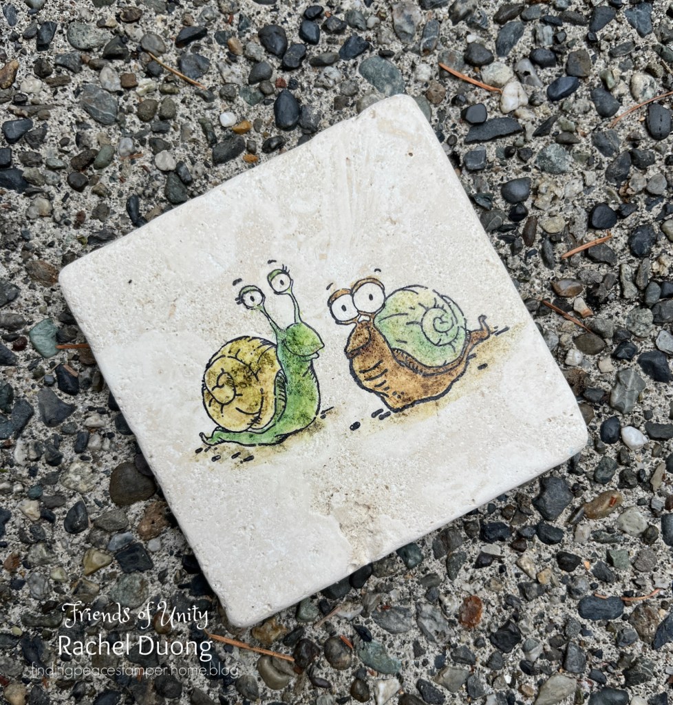
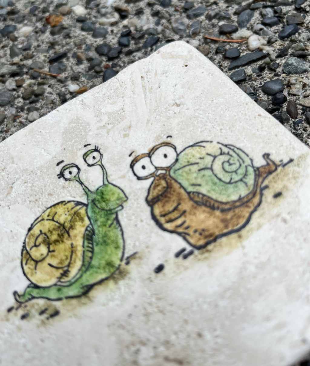
Project #2 ~ Snail Coaster, Snailed It stamp set by Lisa Glanz for Unity
A common inhabitant of my garden are these snails! Their silly eyes are too much fun and how convenient to have a house built in!
I stamped the images on a 4 x 4 travertine tile with StazOn permanent ink. I painted them with Hero Arts ink in shades of green and brown.
A thin coat of varnish and adhesive cork protectors finish the coaster.
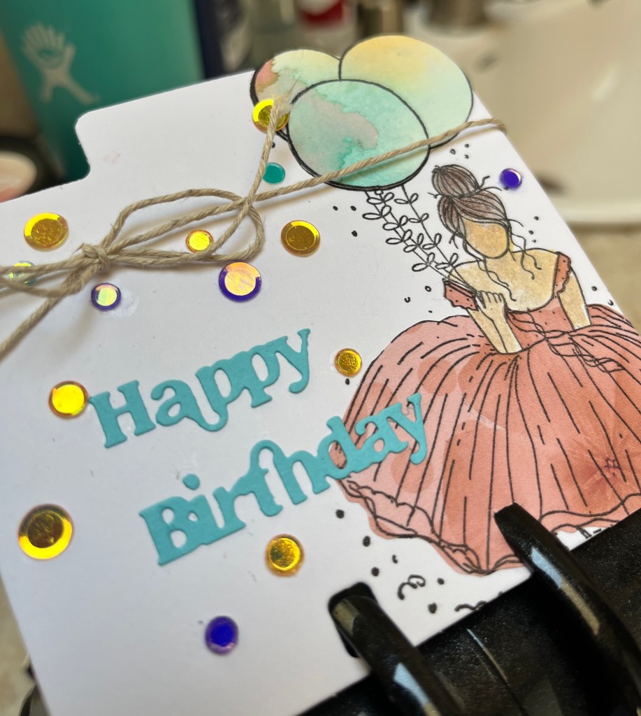
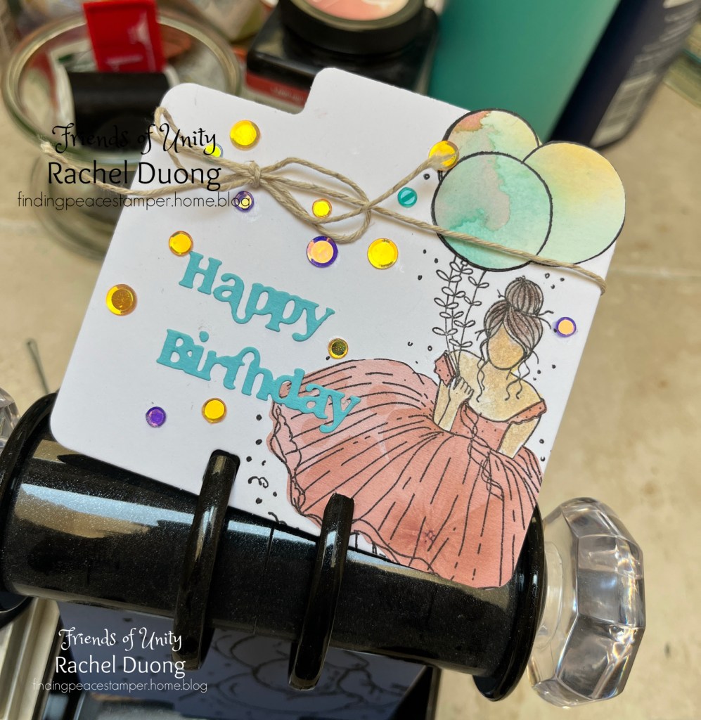
Project #3 ~ Memorydex file by Heidi Swapp, Margaret Girl stamp set by Angie Blom for Unity
A Memorydex is a unique storage item for unlimited ideas to organize recipes, birthday dates, address and phone numbers… Each file fits on a unit that can be looked through by turning the side handles. It is similar to a Rolodex.
I die cut the file from white cardstock and stamped the image in Versafine black ink. I watercolored the hair and skin with watercolor paints. Next I stamped the image on patterned paper and fussy cut the dress out and glued it onto the image. I also used the same paper piecing technique for the balloons. I die cut the sentiment and glued it onto the file overlapping the dress.
Mirrored dots adorn the empty space and burlap twine tied up at the top adds dimension and interest. Finally I put it into the Memorydex for future use. How fun it wuld be to trade Memorydex cards!
Below is a list of the friends sharing projects on the hop. Just click on the names and it will transport you to their blog!
Thanks so much for stopping by! If you get a chance to create something in the “Anything But A Card” theme, please share on the Unity Show ‘n Tell Facebook page. I look forward to seeing you next month. Until then, have a wonderful September full of creative adventures!
Hi crafty friends, it’s August and our Friends of Unity Blog Hop is here! The theme is “Technique”, so I made my cards with a technique in mind. I hope the cards might spark a little inspiration and maybe something you will try if you haven’t done so already!
Card #1 ~ Distressed and monochromatic- Gingko Greetings by Sandhya Iyer for Unity Stamp Company
My first card is a beautiful set of Gingko leaves. My neighbor has a Gingko tree in her backyard and I love the fan-shaped leaves. I began with a sheet of watercolor paper. I stamped the images in Versafine black ink. I loosely painted the leaves and the background in green and teal using Prang watercolors. A lot of water haelped make the color move around the cardfront. I stamped a sentiment from another set I used for this hop on a strip of the same paper. I love the font, so delicate and incursive.
I roughed up the card edges and added washi tape at small angles. Then I glued the cardfront onto a forest background and then onto a light blue cardbase.
Card #2 ~ Patterned paper and watercolor – I Really Love You – Unity Stamp Company
This tree is so beautiful. The hearts make this a heart tree! The fine lines are so fun. For this card I focused on pattern paper. I picked it out and glued it to a pastel blue A2 card. Next I stamped the image on watercolor paper. I added black-brown to the bark. I loosely painted the image tree with like colors to go with the paper. I cut the cardfront down and framed it in eggplant and then framed it again in lavender. I glued it to the card.
I painted the hearts pink and after it dried I added Stckler glitter glue. I stamped the sentiment in Versafine black ink. I glued it down in the lower, part of the card. I stamped the image. Finally I added mirrored embe;llishments around the ears.
Card #3 – Mash-Up – Fan Club Pissy Kitty – Unity Stamp Company
What is a mash-up technique?! I might have made it up but I call a mash-up technique on a card when 3 stamps or die sets are mashed together and used for making cards. This kitty is too funny and I just had to use him. I stamped the image and “stay cool” sentiment on watercolor paper in black Versafine ink. I lightly watercolored a bit of orange on the face and paws. I die cut the bottles from a Tim Holtz die set. I stamped the Chemistry and all sentiments using a My Favorite Things set. I glued the flasks together and tied a baker’s twine around one. I diecut the cardfront with a Gina Marie Designs border die. I lightly blended a teal oxide ink on the lower part of the card. Finally I arranged the card pieces to my liking and glued them down on a kraft cardbase.
A group of friends asked me to make a card for a chemistry engineering student going off to school. He also loves cats. I also think he is pretty cool. So–I hope this card makes sense! This face is too hilarious.
Thank you so much for stopping by. Following is the list of friends on the blog hop. Just click on each person’s name and it will take you to their blog.
Hi crafty friends! Welcome to our blog hop. July’s theme is Mixed Media/Grunge–an art using layering, textures, found objects and distressed effects where imperfections are welcomed. In my mind it means that anything goes! How refreshing and freeing! I found myself asking if this matches or looks good and my answer was that it doesn’t matter so just go for it.
Card #1 ~ Squeeze the Sweetness from Unity Stamp Company, The Kit of the Month – June
This girl is looking out and contemplating her next adventure. I created this card with a lime paper. I placed a stencil over the right side and spread Tim Holtz Distressed Texture Paste over the words. I stamped the figure going off the page in black Versafine ink. Next I masked her off and brushed watercolor over the stamp and pressed on the left siding going all the way down. Then I used a heart die from Poppystamps and painted the outline with many hues ending up with a deep purple, I watercolored inside the heart with rich teals and greens.
I paper pieced the hat and dress, adding more paint to each. I love how the hat goes off the edge. Hero Arts glitter gue adorns the ribbons. on the image. I punched 2 holes in the lower left portion of the cardfront and found a wire ribbon in shiny crimson and gold metallic threads. I wanted a few of my family members about their opinion on the bow and they both said it doesn’t go with the card and I should remove it. I don’t know why but I loved it and kept it anyway! Continuing on, I roughed up the edges with a scissor.
I stapled the top right for a grungy element. I adhered the cardfront to a purple wash on a pink paper, tore the edge and adhered it to a white A2 cardbase. I stamped the sentiment on white, cut it at an angle, affixed a photo corner protector and a black brad over a folded edge and glued it down. Finally a sequin and a pearl and glitter on the drink….phew! Card complete!
Card #2~Thank You Kindly by Phyllis Harris for Unity Stamp Company
I love this card. It is so sweet and the bear, even though he is quite large, looks very friendly. I stamped the card in brown ink on yellow paper and heat embossed with clear powder. I watercolored the scene and included metallic paint on th leaves. A painted die cut frame– I adhered to the card.
Next I glued the image to a black cardbase. I found gold foiled black paper and framed the image.
Beautiful sequins adorn the tree. I embossed the sentiment in silver on black and then placed it partially over a strip of purple/brown/bronze paper and adhered it to the card. I added Magenta Stickles glitter glue is on the dress and flowers.
Finally I bent a copper wire and tied various pieces of ribbon around it!
Thanks so much for hopping! Below is the list of the friends sharing cards on the hop.
Love and Laughter. Hi everyone, today is day 5 and my last day to share my cards as the GIU stamper! I couldn’t decide which card to post so I thought I would post both of them! What I like about this the most is that the first card is a little more quiet and soft, The second– hilarious and fun.
Beautiful is the Calla Lily blossom, I love how majestic they stand strong and brave.
To begin I watercolored the background in a wash of hues and greens. After drying, I stamped the image in green distress ink. Next I combined Prang and MozArt komorebi watercolor paints using a generous amount of water over the layers of color to allow them to bleed and create a soft appearance.
When I was satisfied with the color, I blended white over the areas I wanted to stand out a bit. I adhered the cardfront to a pastel blue cardbase. The I stamped the sentiment in a purple Distress Oxide ink. I let it smudge a little to keep with the feel of the card. I trimmed it down to a strip and adhered it to the card. Finally, an aqua bow glued to the stem adorns the card.
I love how the fower gives off the serenity feel so I kept the card design simple hoping to keep the view on the stand alone Calla Lilly.
Now for alot of laughter! What I love about this lady is her spunk for dressing fancy and her details accesories. She has a flair for fashion and has her own individual style.
I began with a stencil from A Colorful Life Designs and blended Distress Oxide inks over the teal card. I stamped the image and the sentiment in versafine Ink directly over the stenciled pattern. Finally, a pastel blue organza ribbon finishes the card.
This card was a quick make because I didn’t color or embellish the image. I kept her image stamped light so the pattern underneath stood out. I love3 the sentiment because it is clear this lady is a stunner now, more than ever!
Thank you so much To Unity Stamp Company for allowing me the opportunity to be the GIU creator this week. The thousands of images, customer service and sense of community you have built for us is outstanding!
Thank you for stopping by and taking the time to comment on my cards. It has been a pleasure! Happy 4th of July!
Hi there! It’s day 4 of my GIU week. I am switching gears to a new image from Unity Stamp company’s Kit of The Month membership set. I love all the happy summer treats that are here to cool us off on those hot days! What is your favorite treat to cool you off?
To create this card I stamped the popsicle in Versafine black ink on watercolor paper. I painted it in the colors of the rainbow. The popsicle is dipped a silver metallic magic chocolate! I used the MozArt Komorebi watercolor set. I die cut this using a Gina Marie Designs border die.
Next I chose a white A2 cardbase. I used A Colorful Life Designs stencil and blended yellow Distress Oxide ink over it allowing the edges to fade. I went back, blending the the middle space to give the image a nice bold color to stand out from. I adhered the image to the cardfront.
Then I stamped the sentiment in Versafine black ink and cut it into individual words. I adhered these to the cardfront at varying angles with dimensionals for the 3D effect. I also placed the words a bit overlapping for interest. (Look at the spectacular metallic paint)
Last but not least are the embellishments. I used a combination of bakers twine and colorful jute all tied together for the confetti energy vibe.
Beautiful Picket Fence Studios sequins complete the card!
Thanks for stopping by. Have a sweet day, see you tomorrow and remember…anything is popsicle!
Rachel
Check out the memberships at Unity Stamp Company. They never disappoint!
Hi everyone, it’s day 3 of my GIU week and I am having a blast! I’ve got one more card to share with you from Unity Stamp Company’s Rescue Tales Collection. This handsome guy is not fluffy or furry but is lovable and content sunbathing in the warm rays shining through the windowsill. He turns a beautiful orange when content and happy. Do you know what this is without scrolling?!
It is a bearded dragon!! To create this card I stamped the image on Canson XL watercolor paper. To get the fine detail, smooth paper, Versafine Claire ink and a Misti stamping platform are key supplies needed.
Next I painted the bearded dragon using Prang watercolors. I had a picture of an actual fellow that I will introduce to you later!
Then I watercolored many layers of yellow outlining the image. I brushed water on the outer portion and then dripped the colors of the rainbow beginning at the top and coming down around the bearded dragon. I sized the cardfront down to approximately 4.0″ x 5.25″ and adhered it to an A2 white card base. A thin white border frames the card.
Finally I chose a sentiment from another set and stamped it with Versafine black ink on to the card. I refrained from using embellishments because sometimes I like keeping it simple when the dripped background already creates visual interest.
Meet Plopper! This handsome bearded dragon is one of my daughter’s boyfriends charming pet. He is happy and his orange appearance is stunning. He is even smiling! He gets baths and loves to roam around the room and sit with his peeps. (her boyfriend and his friends!)
Hi to all! Today I am sharing another Unity Stamp Company fur buddy from their Rescue Tales line.
To create this card I made a background of watercolors running into one another on a large sheet of textured watercolor paper. After drying I cut it slightly smaller than an A2 card and glued it to a white cardbase.
Next I stamped this adorable image on Canson heavy watercolor paper. The smoother texture creates a nice surface to stamp on. I painted the puppy and also watercolored the background using the same colors as the previous one.I went over the eyes and nose with a black Sharpie marker so the features stood out. I die cut the image using a Gina Marie Designs border die and glued it to the card.
Then I used a scrap of the first background and stamped the sentiment and glued strips from the same paper onto the sentiment for character. Gold matte brads were affixed to the right side and I adhered the piece to the card using glue dots to pop it up a bit. Finally, fuschia Stickles embellished the heart and mirrored confetti adds to the decor!
This is my inspiration for the card. Our sweet Moose is a Havanese puppy (12 years) who just got a short haircut from me– I thought he resembled this dog the most out of all the images in the Rescue Tales colllection. I’m pretty sure the dog stamp is most likely a terrier but his color markings sure matched Moose’s eyebrows and muzzle!
Hi crafty friends! Today is Day 1 as the GIU person of the week. I am looking forward to sharing my cards with you. I absolutely love Unity Stamp Company. The images they keep coming out with are ones that warm my heart and take my breath away. I may sound a little dramatic but my first card is just that! Before I begin, the best part is that I personalized these images to look similar to my grandkitten and grandbuns, the joy added to my life these past few years.
These adorable furry friends are from the Unity Rescue Tales line. When purchased, Unity donates to a shelter to help take care of the animals waiting to be adopted! I stamped these three on watercolor paper with Versafine black ink. I started with the kitten and then the lower bun in the corner. I masked off the bun and then stamped the other bun. I was careful to make sure the hearts were visible and in a good place on the cardfront.
Next I painted the images using Prang watercolors. With photographs I tried to make them look as close to the real life cuties as possible! Finally, I mounted the cardfront on a light grey cardbase and wrapped bakers twine around the top!
PrinceLennyMochaLenny and Prince content and relaxing